


In interior decor, color harmony and balance are key to creating stunning and relaxing spaces. Complementary colors (e.g., blue-orange) offer vibrant contrast for accenting, while analogous schemes (e.g., blue-green) promote serenity. Neutral bases with layered accents or bold patterns enable timeless, adaptable designs that cater to individual tastes and trends. Strategic pops of color add visual interest, transforming spaces into unique, inviting, and modern masterpieces during renovations.
Discover the secrets to harmonizing color palettes in your interior decor. This comprehensive guide explores fundamental color harmony concepts, from complementary to analogous schemes, empowering you to create balanced spaces. Learn how neutral colors establish a serene foundation, and master techniques for adding bold accent colors that make your home truly stand out. Elevate your interior design with practical tips tailored for every aesthetic preference.
- Understanding Color Harmony: The Basics of Complementary and Analogous Schemes
- Creating Balance: How to Incorporate Neutral Colors for a Serene Foundation
- Adding Pops of Accent Colors: Techniques for Bold and Eye-Catching Interior Design
Understanding Color Harmony: The Basics of Complementary and Analogous Schemes

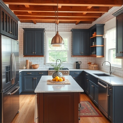
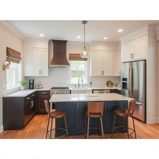
In the world of interior decor, color harmony is a key component that can transform spaces into beautiful and cohesive homes. Understanding color theory is essential for achieving these home transformations. The basics revolve around complementary and analogous schemes. Complementary colors are those found opposite each other on the color wheel, such as blue and orange or green and red. When paired, these colors create vibrant contrast, making them ideal for accent walls or statement pieces in floor replacements or whole house remodels. On the other hand, analogous schemes use neighboring colors on the wheel, like blue-green, green, and yellow-green, offering a more subtle yet harmonious look. This scheme is perfect for creating a soothing atmosphere, especially in bedrooms or living areas.
By combining these color principles, interior designers can craft whole house remodels that are visually appealing and relaxing. For instance, using analogous shades of blue throughout a space can evoke feelings of calm and serenity. Conversely, a splash of complementary colors like yellow and purple can add energy and vibrancy to a room, making it the focal point of any interior decor arrangement.
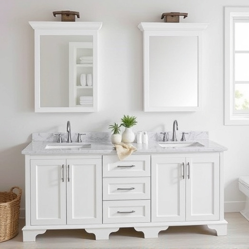
Creating Balance: How to Incorporate Neutral Colors for a Serene Foundation
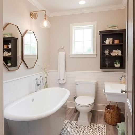
In the realm of interior decor, creating balance is key to a harmonious space. One effective way to achieve this is by incorporating neutral colors as a serene foundation. Neutrals like whites, grays, and beiges serve as a versatile base that allows for easy transition between bolder shades. This strategy ensures a calming atmosphere, providing a sense of equilibrium within the room.
For those considering residential renovations or seeking renovation services to customize their homes, starting with neutral colors offers a flexible canvas. You can effortlessly layer vibrant accents or bold patterns without overwhelming the space. By keeping the base neutral, you create an inviting and timeless interior that adapts to evolving trends and personal preferences, making it a smart choice for any homeowner.
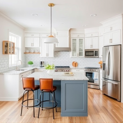
Adding Pops of Accent Colors: Techniques for Bold and Eye-Catching Interior Design
Adding pops of accent colors is a dynamic technique to elevate your interior decor, transforming spaces into bold and eye-catching masterpieces. Incorporate vibrant shades through strategic placement—on one wall, as an accent chair, or even in decorative throws. This strategy creates visual interest, drawing attention and serving as a focal point within the room. When executing residential renovations, consider these accent colors as the finishing touches that make a space truly unique.
For a striking impact, choose complementing or contrasting hues that contrast with your primary color palette. For example, pairing deep blues with warm oranges or soft neutrals with bold greens can create a captivating interplay. Whether you’re planning home renovation projects or simply looking to refresh your interior painting, these accent colors can instantly modernize and personalize any space, making it both inviting and memorable.
Incorporating harmonious color palettes into your interior decor allows you to create visually appealing, cohesive spaces. By understanding complementary and analogous schemes, balancing neutral tones, and strategically adding accent colors, you can transform any room into a tranquil oasis or a vibrant sanctuary. These tips provide a solid foundation for achieving balanced, eye-catching designs that reflect your personal style.